|
I have started to get much better at using Adobe Illustrator, and I am now at a similar skill level to my ability in Adobe Photoshop. I wanted to research more ways to practice and improve in Illustrator. Something I researched was how to get better at being creative and having more appealing ideas. To have more creative ideas, you can try drawing ideas on paper first. You can also look at other types of media, such as books or digital images for inspiration. Another thing I learned about was the Clipping Mask Tool. This is similar to the vector mask in Photoshop, and allows you to put the texture of something onto a defined shape. I used this tool in creating one of my playlist covers, which I included below. I used a clipping mask to put the galaxy texture onto the could shape in Illustrator.
design.tutsplus.com/articles/10-essential-tips-tools-all-adobe-illustrator-beginners-should-learn--cms-23163 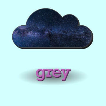
0 Comments
My skills in Adobe Illustrator have improved over the last few weeks, and now I am able to make better art overall and I want to learn how to use new tools to improve my skills even more. The two tools I researched were the Rotate Tool and the Perspective Grid. The Rotate Tool can be accessed with 'R' on the keyboard, and it is an easy tool to use. Simply select what you are trying to rotate first, select the Rotate Tool, and click and drag to rotate your object, like you are using the Group Selection Tool. The next tool, the Perspective Grid, is another simple tool. The keyboard shortcut for this tool is Shift+P. This tool brings up lines over your art that help you draw with perspective. You can click and drag to move the lines around and you can use other tools without accidentally selecting the perspective lines. To turn off the Perspective Grid, you can click the 'X' on the icon that will appear once it is turned on.
helpx.adobe.com/illustrator/using/perspective-drawing.html After using Adobe Illustrator for more art and getting more experience with it, I have grown to like Adobe Illustrator more, but I still prefer Adobe Photoshop. I decided to research ways to improve my skills in Adobe Illustrator to improve my skills and hopefully boost my interest in vector graphics. The first thing I learned about was new keyboard shortcuts. For example, to use the pen tool, you can press 'P'. You can also use the direct selection tool with 'A'. Another thing I learned was that one of the most important things you should to do get better at using Illustrator is practice using the pen tool and the Bezier tool. Both of these tools will help greatly to create smooth curves and make exactly what you want in Illustrator. The last thing I learned was to use the Symbols tool to easily make editable copies for your image. You can put a certain shape into the symbols panel to save it as a shape and drag it out onto your image
https://helpx.adobe.com/illustrator/using/default-keyboard-shortcuts.html I recently began using Adobe Illustrator. I have noticed many differences between it and Adobe Photoshop, and I am not sure which I prefer more to use. The main difference between Adobe Illustrator and Adobe Photoshop is the graphics they use. Photoshop uses bitmap graphics, which is editing specific points on an image with a set resolution. Illustrator uses vector graphics, which uses paths and anchor points and has no set resolution, rather it uses equations to keep an image the same resolution no matter how zoomed in or out you are. In Adobe Photoshop, when you are trying to make something or edit something that is there, you select whatever you need and can manipulate it using different tools. In Adobe Illustrator however, you have to edit anchor points, which
change the path between them, editing the shape or line. Adobe Illustrator is better for making digital art, such as logos or designs for a website. Adobe Photoshop is better for photographs and editing things that already exist, and less for making new art than Illustrator.
https://www.printwand.com/blog/when-to-use-adobe-illustrator-vs-photoshop-vs-indesign A drawing tablet, or a graphic tablet, is a tablet or pad that you use a pen to draw on instead of using your mouse. It makes drawing on a computer much easier and on certain programs, can open up new tools and techniques to use. For example, in Adobe Photoshop, using a graphics tablet and pen, you are able to access pen pressure in the brush panel. This is useful if you want to shade and make different parts of an image appear 3D or different sizes. You can access this in the brush presets panel. For example, with pen pressure on, shape dynamics will change the shape of what you are drawing depending on how hard you press. Similarly, color dynamics will alter the color of what you are drawing on a gradient between your foreground and background colors based on how hard you press.
www.computerhope.com/jargon/g/graptabl.htm I have had the opportunity to extend my knowledge on Photoshop, and I have learned a lot about combining images and creating something composed of different images. For example, I have learned that when changing layer styles, multiply and overlay are good to keep realism. It is also good to experiment with filters to see what looks best. Another thing I have learned is that when combining images, to make things look more professional and realistic, taking your time, being careful, and using non-destructive editing helps greatly. Lastly, it is very important to have a vision of how you want your image to look at the end. This way, you won't get stuck as often and you know what to do.
www.youtube.com/watch?v=8v1jst5Vx0E When developers and creators make a game, during production, they usually start by making assets of a game. When finished with making most or all of the different parts, they are put together using composition techniques to create a more fleshed out product. In my Fundamentals of Design and Animation class, we did exactly this. First, we created the assets of a game. We made rocks, mountains, a sky, a character, trees, and grass. Once finished with making all of this, we combined all of these pieces together into one final image. I did more research on how to better bring together assets and how to keep separate parts consistent. Some tips I discovered were helpful to me. When making parts that will be brought together, they should be consistent. The name of the files should be consistent and should use similar titles so that they are together. Another thing you should do is keep the assets consistent in size. This is so one image is not too large when put with another. The last thing I learned was that when both creating and putting assets together, you should make sure to not rush when necessary and to take everything one step at a time. It would be more effective to make one asset to completion instead of making parts of many assets at once. It would make mistakes less frequent and easier to fix.
https://gamedevelopment.tutsplus.com/tutorials/bringing-your-game-to-life-in-10-simple-steps--cms-23447 In my Fundamentals of Design and Animation class, we have been working in Adobe Photoshop more in different activities and learning new tools. Certain tools I have used recently interested me, and I decided to research them further. These tools are the warp tools and the filers. To get to the warp tool, you must transform a shape, or press Ctrl+T, then click on the warp icon. The warp tool is a tool used to alter the shape of an image from different points. With it, it is possible to stretch and pull your image, making a straight line wavy or adding smoothness to a curve. It can be used to completely alter a shape, or be used to fine tune something and make it look the way you want it to. The different filters you can use add new textures or colors to your image. You can change effects or styles to your entire image to create something completely different, or like the warp tool, you can fine tune to perfection.
https://helpx.adobe.com/photoshop/using/filter-basics.html Super Mario Odyssey is an incredibly popular game made by Nintendo for the Nintendo Switch that came out on October 28, 2017. In Super Mario Odyssey, you play as Mario, Nintendo's well known character that has been in many popular games in the past, such as Super Mario 64, Super Mario Sunshine, and Super Mario Galaxy. Super Mario Odyssey is the next 3-D game with Mario in it since Super Mario 3-D Land for the Nintendo 3DS. In this game, you traverse many worlds with different unique themes and complete fun challenges. There are worlds with many different themes that all feel very inspired and original, such as New Donk City in the Metro Kingdom, the Sand Kingdom, the Seaside Kingdom, and Bowser's 's Kingdom. One of the most fun and original parts in Super Mario Odyssey is Mario's new ability. He can now throw his hat, which is actually a hat possessed by a ghost named Cappy, to become, or "capture", objects and enemies. There is a wide variety of things you can capture, and it is very fun to find new things to capture and see what you can do with them. One of the most fun parts about Super Mario Odyssey is the different things you collect. You collect "Power Moons" which are used to power your ship that takes you to each kingdom. Each Power Moon is extremely fun to find and collect, and it feels satisfying to find them all and find the numerous secrets. When it comes to aesthetics, Super Mario Odyssey is not lacking. Each character is colorful and looks cheery, and the different worlds and environments are diverse, yet similar in that they are all beautiful in their unique ways. Super Mario Odyssey is an incredibly fun game that can be played by yourself or with a friend. It is fun to complete and it is fun to replay or collect everything after you have completed it.
In my Fundamentals of Design and animation class, we created a color palette used in a few pictures for a game we pretended to describe and use colors as a selling technique. The colors of certain game covers can effect selling by giving the consumer a certain feeling based on the culture of the place they live in. For example, the color blue in American and Western culture is calm and cool. If blue was used on the cover of a game, it would convey a calm emotion to the person looking at it. I did more research on color palettes that would convey calmness in Japanese culture. I also researched a more specific color palette, one that would be used to create a painting of space. In my research on a calm palette in Japanese culture, most of the colors were pastel colors. There were many light pink colors, some light blue colors, and some ivory and cream colors. I discovered that these colors convey a loving and peaceful emotion in common Japanese culture. When doing research on the space or galaxy palette, most of the colors were black, purple, and dark blue. This is very common in galaxy themed pictures, items, or drawings.
http://www.color-hex.com/color-palette/23298www.color-hex.com/color-palette/23298 |
